Assignment 3-2: Logo Tanya R. Tate GRPH310 V1WW
Walk of Fame
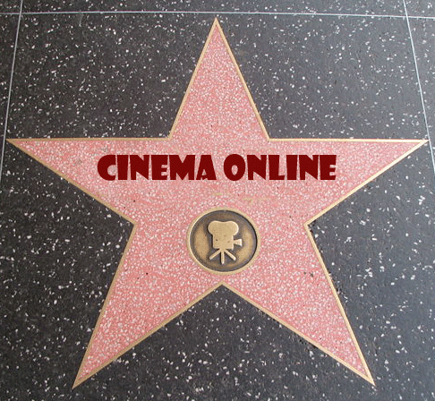
Includes main 3 colors recommended by team mate, black, gold & red
Another idea inspired by team member feedback
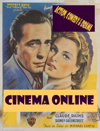
Not developed due to potential copyright issues
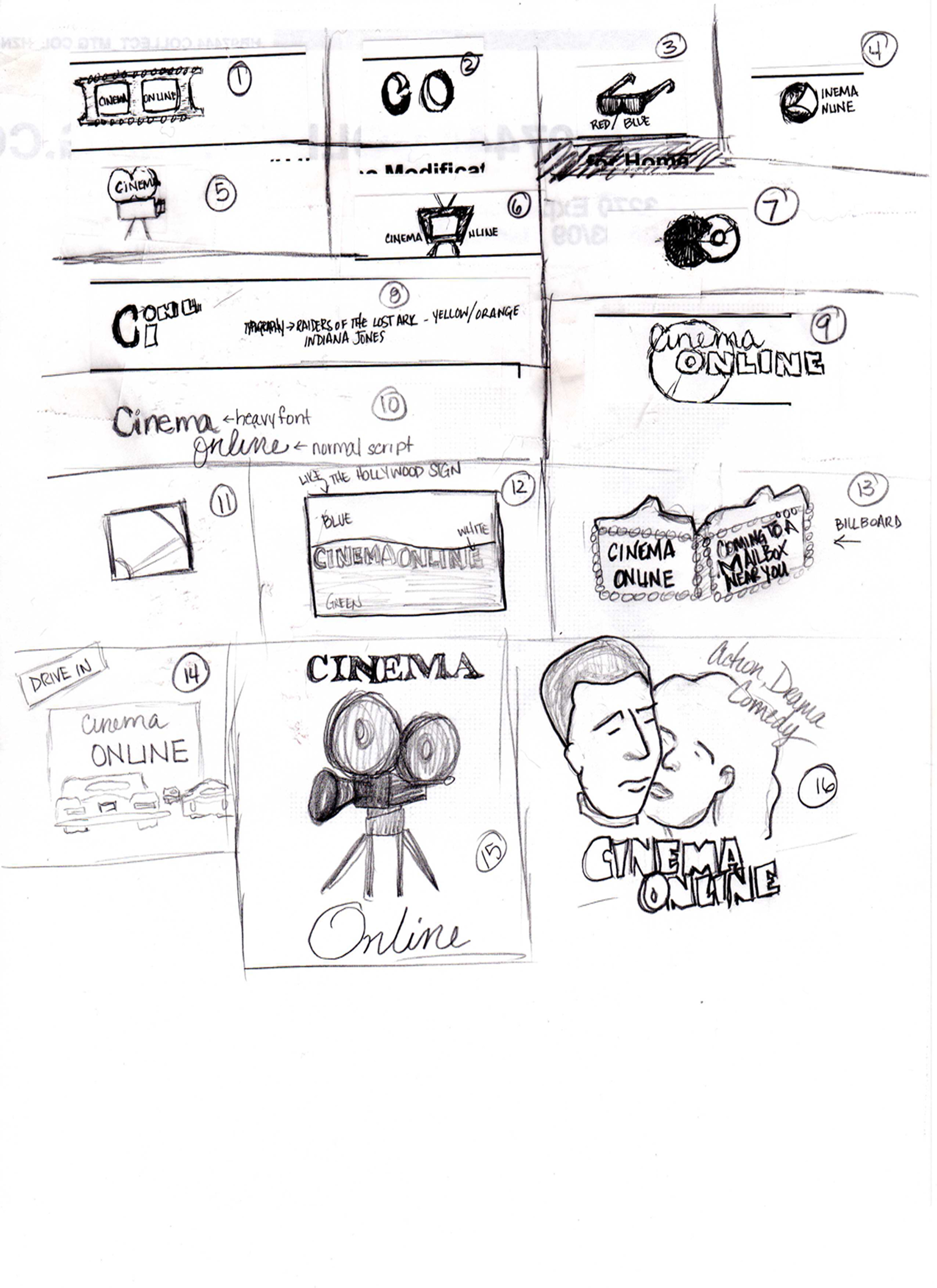
My original ideas were typographical in nature. I attempted to use the "C" and "O" to develop a logo that looked like an old movie camera as an homage to the Old Hollywood theme we were looking for. Unfortunately, these early efforts never yielded anything I could use. I had a bit more success with the illustrative ideas, utilizing the camera, the movie theater scene, the Hollywood sign and Walk of Fame and the DVD to reference the company mission.
Includes the feedback I received from a team member.
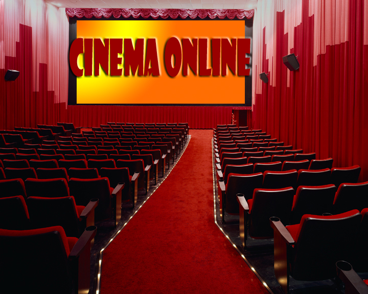
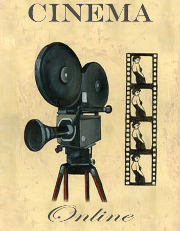
Old Hollywood
This idea would translate both in color and in black & white.
This was one of the very first ideas I came up with but it wasn't very Hollywood
The Theater Scene logo incorporates the idea that using this client's service is akin to the theater experience. This image tells the customer that using Cinema Online is as good or better than going to the theater. The client has recently introduced HD and Blu-Ray and all DVDs are DTS and Dolby 5.1 sound compliant. The quality of the experience is defined in this image. The red velvet gives it the style and sophistication as well as the vibrancy we feel the client represents. The font is Show Card Gothic which will be the main font of choice for this client. It is bold and reminiscent of old movie posters.
The Walk of Fame logo was the last idea I developed. The photograph of the star as it was already included the color scheme I had developed for this client. The old movie camera was already there and the stars on Hollywood's Walk of Fame are iconic. All I added was the Cinema Online name to it.
The Old Hollywood logo was chosen for its versatility. The movie camera and film strip are obvious references to the movies in general. The fonts were chosen for their contrast to each other and for the stylistic references the client was looking for. This logo can be adapted with many different colors, or it can remain monochromatic depending on how the client chooses to use it.