Project History:
Back in 2008, my husband and I visited the Stax Museum in Memphis, Tennessee, which used to be the home
of Stax Records. The building was once the old Capital Theater in a neighborhood referred to as
Soulsville, USA. Steve Cropper originally bought the place for his small record store, but in 1959
he changed the business into a recording studio (SoulsvilleUSA, 2011). After reviewing my pictures,
the artists mentioned in the sign that is in front of Stax inspired me for this project.
Original Pictures:
One is a picture I took of the Stax Museum, and the other two are from
the Soulsville website. A few images not shown above, I found in a Google search: a star, barcode, and
two logos of Acadamy and Stax Museum
References:
SoulsvilleUSA. (2011). About Stax. STAX Museum of American Soul Music. Retrieved from
http://www.staxmuseum.com/.
Back Cover Steps:
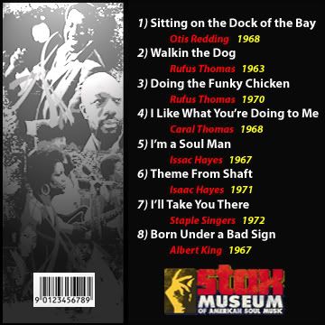
- I placed all the images that I planned to use in the editor, resized each image accordingly, and converted some
of them to RGB mode by using the Mode command from the Image menu. I created a new file, sized it at 5x5,
and then used the paint bucket to fill it in with black.
- Next, I dragged the Collage image into this file, resized the image and moved it to the left side. I then cropped
the bar code image to get rid of some if its background, moved it on top of the collage, then used the
Send to Back command on the collage.
- Next, I typed in the text for the songs, artists, and years; 14pt font, bold, and white for the songs; 12pt font,
bold Italic and red for the artist; 12pt bold and yellow for the date. I then dragged the Stax Museum logo
into the file, used the Move command, and resized it.
- I went back to the collage layer, widened it so that it would be closer to the song list, put a black border
around it by using the Stroke (Outline) command from the Edit menu, and dimmed it a tad. Last, I used the
Spotlight filter on the collage.
Front Cover Steps:
- First a created a new file for the front cover, placed the planned images into the editor, and made the necessary
steps (as above). I started with the picture that I took of Stax Museum, used the Quick Selection tool to
select the sign in front of the museum.
- I copied the sign to a new, transparent file, and then dragged into the newly created file for the front cover.
Since my selection job was not the greatest, I cropped it to get rid of the stand, and then put a yellow
stroke, followed by a red stroke around it.
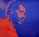
- I then dragged the image of Otis into the file, and placed this layer below the sign layer. I went back to the
sign layer and dropped the opacity so that the Otis image would show though it. From there, I typed in the
title, used the arch mode, adjusted it and brought it forward. I then typed in the bottom text.
- Next, I opened the star image, gave it a black background, and dragged it into the image, moved and resized it,
and then repeated this step for the other star. Since I had to have another image, I opened the Stax Academy
logo, selected only the logo, copied it to a new transparent file, then dragged into the background layer,
positioned and resized it.
GO BACK TO TOP OF PAGE


